Hi,
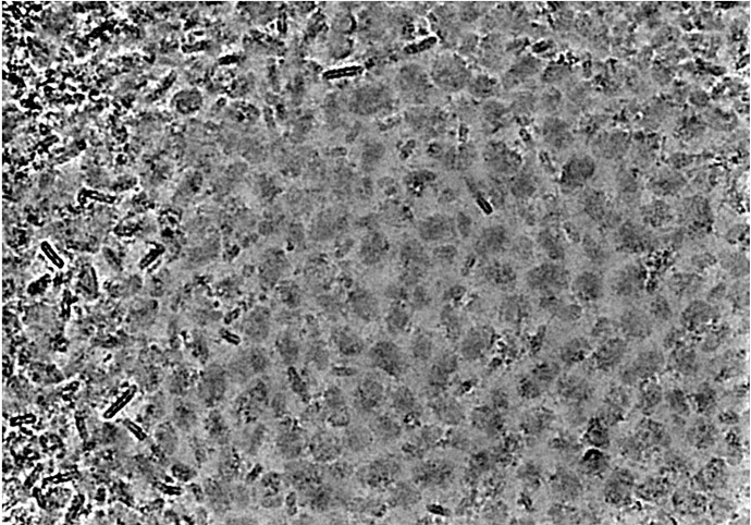
When I input denoised micrographs into Manual Picker, it seems like the highlights and shadows are pretty severely clipped (see example below).
I suspect that cryosparc is automatically thresholding the top/bottom 5% of intensity values, which makes sense normally, to increase contrast, but not for denoised images, which have intrinsically higher contrast. Playing with the contrast intensity override does not help. Would it be possible to add an option to turn this behavior off?
It would also be helpful, when inputting denoised images, if one could toggle between denoised and original while picking, as denoising sometimes gives artefacts near the edges of micrographs.
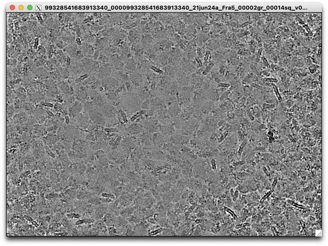
An image from the same denoised set is shown as viewed in relion_display, so you can see the highlight clipping is not intrinsic to the denoised images.
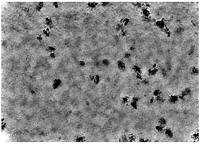
This gets even more pronounced for micrographs that have sparser than normal particle distribution, which makes me think that it is some kind of auto-contrast routine that doesn’t behave well on denoised mics:
A fix for this phenomenon is included in release 3.3.2
2 Likes
Hi @wtempel, just tested this, it seems that there is definitely more latitude to tweak the settings via the “Contrast Intensity Override” slider, which is great.
One thing I would suggest is making these settings persistent for an active job. Currently if I undisplay and then redisplay the job, the slider resets itself, which is annoying as these parameters can require a bit of tweaking to get just right.
Cheers
Oli
Hi @wtempel,
I don’t think this fix made it into the updated Manual Picker in v4 - the clipping of highlights and shadows in denoised micrographs is back, and the contrast-intensity override slider is gone.
Would it be possible to add this fix back to the new version?
Cheers
Oli
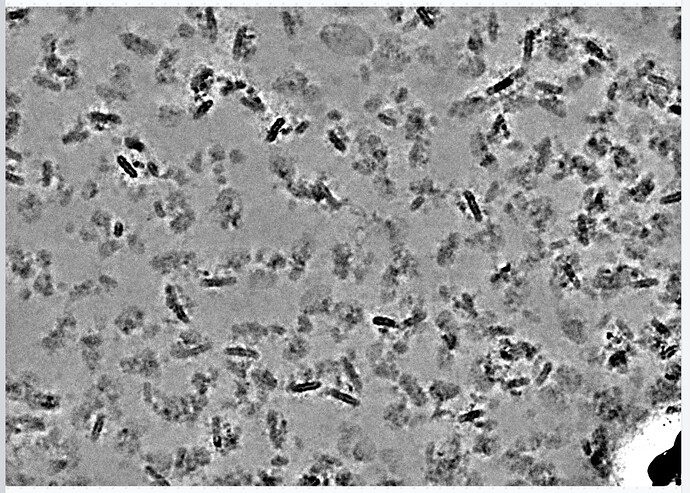
Just bumping this @wtempel - I don’t think this fix from 3.3.2 made it into 4.3 either, highlights and shadows of denoised micrographs are still clipped… e.g:
Hi @olibclarke ,
The contrast intensity override is located in the overflow menu (triple dots menu), is this what you’re referring to?
- Suhail
2 Likes
That is indeed what I was looking for, sorry I’m an idiot 
That works well, thanks!!!
One other thing - I like the “pan on scroll” function, but if I accidentally scroll outside the micrograph area (in Chrome), it no longer works, so I then cannot pan back to the micrograph.
I think this is because it requires the cursor to be over the micrograph to activate.
Perhaps the panning could be locked such that it is not possible to pan outside the micrograph, or a border region around the micrograph could still allow panning, to avoid this?
Also it would be great to have keyboard modifiers to switch between adding and removing picks (in addition to the different tools) - e.g. click to pick, Ctrl-click to remove. Same for switching between zooming and panning - something like scroll to pan, shift-scroll to zoom would be really nice
Hi @olibclarke ,
Thanks for the additional suggestions. I’ll make a note of the pan/zoom issue you described.
There’s already a mode to switch between zoom on scroll and pan on scroll:

We can certainly add a modifier that enables whatever the opposite is when another key such as shift is pressed.
For the manual picker, right click will perform the opposite action, so in ‘add picks’ mode, right click will remove a pick. This was an improvement added to v4.3.
- Suhail
1 Like
Ah great, I didn’t realize the right click to remove had been added! Yes I know there are pan/zoom modes, but a keyboard modifier to switch between them would be great! 


