Can anyone help me interpret these plots:
These are the outputs of running CTF estimation job.
Hi @Ashwin-Dhakal! Let me try to explain these plots a bit for you.
The first plot is used to assess the fitted envelope function. It plots the fitted CTF, the power spectrum, and the envelope. I discussed it a bit in another forum post.
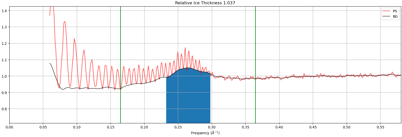
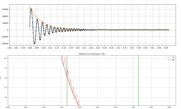
The second plot should show you the relative ice thickness, like this one:
In these plots we measure the background strength (black line) in the region where thicker ice increases background (blue fill) and call that the “relative ice thickness”.
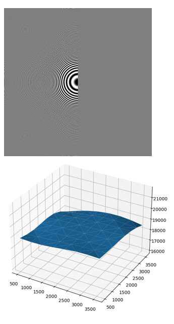
The last two plots show you information the fitted 2D CTF. On the right is the power spectrum of the micrograph, and on the left is the fitted 2D CTF. The blue surface plot shows you the fitted defocus for each position along the micrograph. The x- and y-coordinates correspond to the coordinates of the micrograph, and z corresponds to the defocus.
These plots don’t look quite right — can you confirm that all four came from the same micrograph? I’d like to try help figure out what’s going wrong during your CTF estimation.
I would guess it is after motion correction with motioncor2 instead of Patch Motion? In my experience something about the difference in background estimation between the two throws off the relative ice thickness measure and also results in non-visible Thon rings in the 2D power spectrum plot
Interesting!! How curious!
It was reported here, but as far as I am aware not fixed yet: Thon rings not showing up in exposure curation
Thanks @olibclarke for pointing out the likely cause - noted!
@Ashwin-Dhakal to confirm, were your micrographs coming from motioncor2 rather than patch motion?
Recently, I was preparing a lecture for the LBMS cryo-EM workshops and found that I don’t really understand this plot. I have two questions.
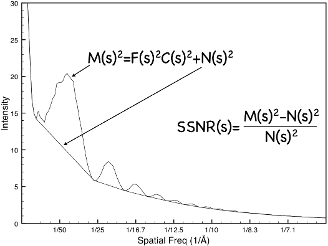
The power spectrum is the squared product of the CTF, structure factor, envelope function, plus background noise. The local minima are used to estimate the background noise. After noise subtraction, the minima should be at the same level (either zero or a baseline value). In CTFFIND4, the amplitude spectrum is used (the square root of the power spectrum), and in GCTF, the log amplitude spectrum is used. In both cases, the minima should be at roughly the same value. Why do the PS minima in this figure not lie at the same value? Why does the PS look like the CTF itself?
The CTF in the figure looks like a phase-flipped CTF — all the minima are at zero.
Why is that?
I discussed this with my colleague but still do not fully understand it. I hope either Oli or the cryoSPARC team can help. (@olibclarke @rwaldo @apunjani )
Thanks.
Liguo
Hi @Liguo!
Please let me know if you have any more questions!
Thank you for the reply.
Usually the background is the local minimum of the power spectrum as shown in the figure I came across many years ago (sorry, I forgot the original source). After subtraction, the power spectrum local minimum should be around zero, not like the black curve shown above. This suggests that there may have been additional manipulations of the power spectrum.
Hi @Liguo, great question. CryoSPARC determines the background differently, such that the background level attempts to stay in the “middle” of the oscillations, not the minima. This is why the background-subtracted power spectrum dips below zero.
Thanks. So the PS is the modified power sepctrum and the CTF is the CTF squared.
Right! Fixed the typo in my response haha.