Hi @mroy and welcome to cryoEM! I’d be happy to walk you through the outputs of a patch CTF job, and I’ve made a note to add a bit more explanation to our guide!
I’ll include an example image of my own here — it looks like you’re working with super-resolution data which scrunches the values up to fit in the higher resolutions. You may want to consider using Fourier cropping during motion correction to go back to physical pixel size, as it will speed up CTF and particle picking, but that’s up to you!
The plot in question is mostly used to ensure that background subtraction and envelope function fitting have succeeded — it is more diagnostic than informative.
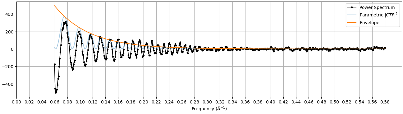
Here, the X axis is the frequency in inverse Å. What we would typically call “higher resolution” signals are further to the right in this plot. The three things plotted in these graphs are:
- In black, the radially-averaged power spectrum. The bright parts of the Thon rings would have a high value here, and the dark parts a low value.
- In orange, the envelope function. Theoretically, Thon rings should continue all the way out to the Nyquist resolution, but because of various aberrations they fall off at higher frequencies. The envelope function is a way of modeling this falloff.
- Finally, in blue, we plot the fitted CTF scaled by the envelope function. Here it is plotted oscillating between the envelope and 0, since this plot is mostly to ensure that background subtraction and envelope fitting have proceeded as expected.
The final CTF fit, which is more important to interpreting the results, are shown in this plot instead:
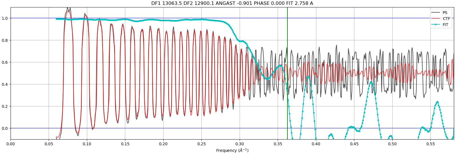
which plots the power spectrum (black) and the fitted CTF (red) as well as how well the agree with each other (blue).
I know that’s a lot of information! Please let me know if you have any more questions!