Hi Everyone,
How can we interpret these plots from the Ab-initio and Homo Refine jobs?
What are the x and y axes and the heatmap like plots ?
I would appreciate your help.
Thanks!
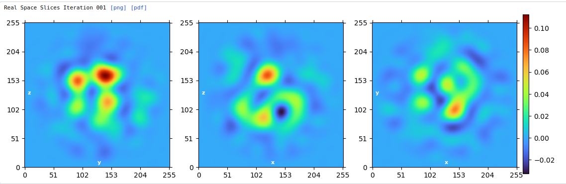
Ab-initio:
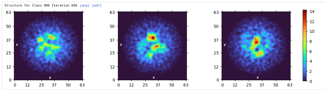
Homo Refine:
Hi Everyone,
How can we interpret these plots from the Ab-initio and Homo Refine jobs?
What are the x and y axes and the heatmap like plots ?
I would appreciate your help.
Thanks!
Ab-initio:
Homo Refine:
Dear @Ashwin-Dhakal,
In refinement jobs, these plots show heatmaps of the real-space density being actively solved by the algorithm. Specifically, each subplot shows a density slice along one of the coordinate planes: z-y, z-x, and y-x, respectively. The color is proportional to the scalar density value at each voxel. If you are familiar with UCSF ChimeraX, you can obtain a similar visualization by using the orthoplanes functionality in their volume viewer.
In ab-initio jobs, these are projections of the density. Instead of slicing the density along a plane, the density is summed (integrated) along the normal to that plane, and the resulting sum is displayed.
Michael
and units of axes are pixels of the box - and ab initio is often binned internally. 0-255 means 256 box