Hi,
Congrats on the release of cryoSPARC2! Some great new features 
The “tree view” option for viewing workflows is a great start, but there are a couple of bugs I think:
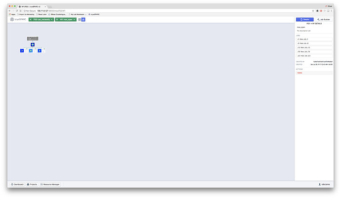
- If the tree view is activated within a work space, the tree is by default really tiny and not zoomable (using trackpad).
- If one clicks back to the project layer from the workspace layer while tree-view is activated, all the workspaces are gone.
- If one is in tree view in the project layer, and selects a workspace using the drop down selector, everything is gone.
- If one is in tree view in the project layer, and selects (clicks on) a job, now only the workspace containing that job shows in the workspace drop down, making it impossible to navigate to other workspaces in the same project (and there does not seem to be a way to deselect a job
- In general the “trees” seem to load really small, and zooming works inconsistently - they should auto-scale to the available area. I would also suggest an option to hide cards of jobs that are not in some way connected to the current job - this would help when viewing multiple parallel but not interconnected workflows in the same workspace.
Cheers
Oli
Hi Oli,
Thanks! We’re excited to get v2 in the hands of the community 
We’re still working on refining the tree view, although some of what you brought up can already be mitigated:
Our documentation is worth going through as there are a lot of new updates (specifically the
tree view)
Keyboard shortcuts:
-
alt + scroll to zoom,
- Scroll or drag to pan
- Click job cards to select
- Click on job ID on card to inspect
- Double click canvas to deselect
- Click the ‘building’ tag of a job card to activate the job builder
We haven’t experienced any blank screens in the tree view. If you have a project with many (1000+) jobs, it may take some time to load.
Please let me know if that helps!
Thanks,
Suhail
Hi Suhail,
Thanks that does help!
- Got it. For some of my workspaces, I can’t zoom out far enough to view the whole tree.
- This works, but I would suggest restricting the range of panning (currently it extends far beyond the tree)
3/4. fine
- Fine, but I would suggest single clicking to deselect would be more intuitive.
The blank screens happen pretty reproducibly in my hands (not a loading issue). I’ll make a screen recording to demonstrate.
Cheers
Oli
Thanks for the additional info!
- We’ll look into changing how far you can zoom out depending on the size of the tree
- Definitely on our to-do list, it will be part of an upcoming release
- We can’t enable single click on the canvas to deselect a job along with allowing users to click and drag the canvas to pan (e.g. if the mouse cannot horizontal scroll). Perhaps we can add a user option to opt-in to this behaviour?
Great, a video would help us understand what’s going on. Again, we’re still in the tweaking phase for the tree view and will continue to improve it going forward.
Thanks,
Suhail
1 Like
Re 3 fair enough, I’m too used to using a trackpad I guess!
The resource manager is a great improvement by the way, makes it a lot easier to keep track of things. It would be useful perhaps to add a tab to this for recently completed jobs?
Cheers
Oli
Glad you like it. Improvements to the resource manager are already in the pipeline, expect an update soon!
1 Like
A “reset view” button would also be helpful for the tree view, I think, to recenter and return the zoom to default.
Also (unrelated), when you expand the view of a job (pressing spacebar), and then try to use the Project or Workspace drop down selectors, the dropdown list loads behind the expanded job card.
Cheers
Oli
DM-ed you a screen capture - thanks @sdawood!
Cheers
Oli
1 Like
Also @sdawood,
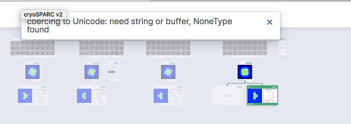
If you select a job in tree view at the Project level and attempt to clone it, it appears to clone successfully (a new card appears), but it gives the attached error message, and if you reload the view the card is gone. What’s more, after you do this, the dropdown selectors for both Projects and Workspaces are empty and remain so, even after navigating to another workspace.
(Unrelated, but I don’t understand why cloned jobs are not editable by default? The most common use case - at least for me - for cloning a job is to edit a parameter and then run a tweaked version of the job. Why do I have to press “B” to do that, why not automatically load the job as editable?)
Cheers
Oli
Re 3 @sdawood - why not just have selection be like a toggle - single click on job to select, click on job again to deselect? This would be more intuitive to me than either single or double clicking on the canvas, and wouldn’t interfere with click-dragging the canvas to pan.
Cheers
Oli
Another thing @sdawood - the UI in the “cards” view has some inconsistencies with the “tree” view at the project level.
If I am in the “card” view, and I click on a job card, it instantly takes me to the relevant workspace and opens the job. Pressing spacebar then brings me to the workspace view, not the project view.
If I am in the “tree” view, clicking on a job selects it. Pressing spacebar then brings up the job page, and pressing spacebar again returns to the project-level “tree” view.
I think the latter behaviour is correct - click to select, space to expand, space again to minimize - and this should be the same for both the “card” and “tree” views to be consistent.
I also think it would be helpful if more info was shown in the job “card”, both in the project-level and workspace-level views. Currently, each card is just labeled with the job number and type (e.g J27 “refinement”), even if the user has entered a more specific job title and description. It would be more informative if at least the title and description were shown in the card.
Alternatively, having a third “list” viewing mode, where jobs are presented with associated metadata in columns (e.g. date, job-type, resolution, number of classes, number of particles, etc) might be another way to help with navigation of large/complex workspaces.
Cheers
Oli


