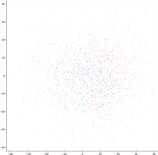
Hi ! From this plot, is there any way to understand how the different colors relate to the cluster numbers ? For example, yellow is cluster 1, etc. thanks !
Hi @marino-j,
A legend for this scatter plot in 3D Variability Display (cluster mode) was added in Patch 220824 on CryoSPARC v3.3.2. If possible, are you able to update CryoSPARC?
Best,
Michael
