Hi @Ashwin-Dhakal! Let me try to explain these plots a bit for you.
The first plot is used to assess the fitted envelope function. It plots the fitted CTF, the power spectrum, and the envelope. I discussed it a bit in another forum post.
The second plot should show you the relative ice thickness, like this one:
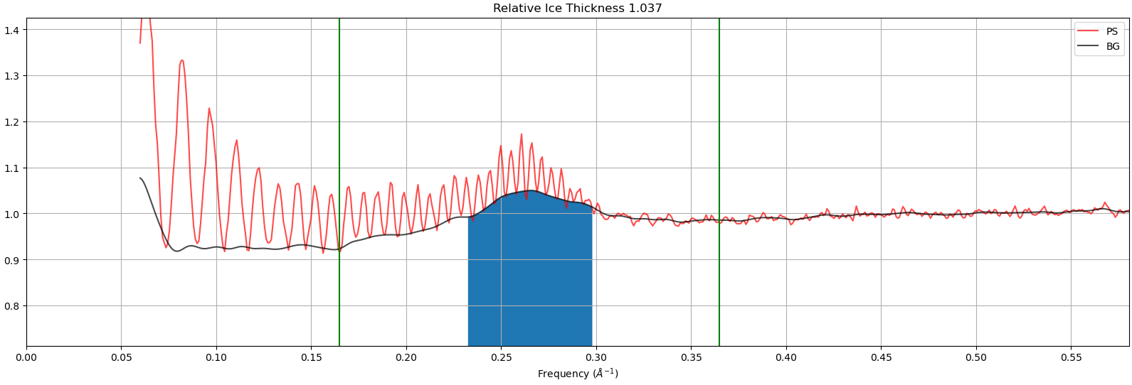
In these plots we measure the background strength (black line) in the region where thicker ice increases background (blue fill) and call that the “relative ice thickness”.
The last two plots show you information the fitted 2D CTF. On the right is the power spectrum of the micrograph, and on the left is the fitted 2D CTF. The blue surface plot shows you the fitted defocus for each position along the micrograph. The x- and y-coordinates correspond to the coordinates of the micrograph, and z corresponds to the defocus.
These plots don’t look quite right — can you confirm that all four came from the same micrograph? I’d like to try help figure out what’s going wrong during your CTF estimation.