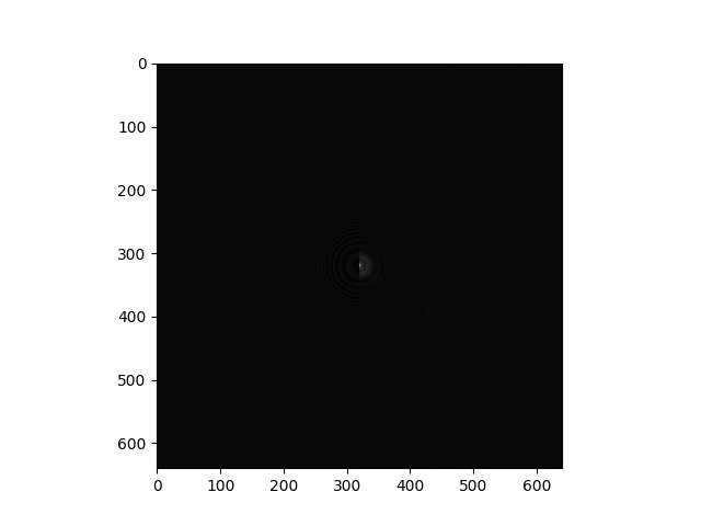
I was interested in looking at the 2D CTF plots to identify crystalline ice and other features for a project I’m working on. To do this, I wrote a script to create a PDF with images taken from the “ctf/diag_image_path” field in an exported exposures.cs file, but I noticed there were significant differences between these images and the images I saw for 2D CTF in the curate exposures job. If anyone knows how I can get comparable images to those featured in the job, that would be a huge help. I’ve provided examples of the images below.
Hi. I tried reversing any log scaling and normalizing all the resulting values between 0 and 1, but the result I get after plotting is no better. I’ve included it below
Power spectra are usually log transformed for display, because the low frequency components are orders of magnitude stronger than the high frequency ones. Did you try log transforming the diagnostic image? If they haven’t stored the final image, it’s probably a power spectrum.
If might also be already prepared and just off-scale in your viewer, you can try adjusting the contrast as well. (Which I called scaling before).
Thank you for the quick response. I might not be understanding. For reference, the .mrc file I get from “ctf/diag_image_path” has entries that appear to range between -1 and 1, which suggests to me that it’s already log scaled. One thing I’ve tried is linearly normalizing the array to have values between 0 and 255 before using pyplot.imshow with vmin=0 and vmax=255, but that just gives me the result from my original post. Presumably, with those settings, it should be using all greyscale values, but I still don’t get anything like what’s displayed by cryosparc.
Hey @avd38, Curate Exposures only adjusts the contrast of the image from ctf/diag_image_path. The minimum and maximum values are set with this function:
def contrast_normalization(arr_bin, tile_size = 128):
    '''
    Computes the minimum and maximum contrast values to use
    by calculating the median of the 2nd/98th percentiles
    of the mic split up into tile_size * tile_size patches.
    :param arr_bin: the micrograph represented as a numpy array
    :type arr_bin: list
    :param tile_size: the size of the patch to split the mic by
        (larger is faster)
    :type tile_size: int
    '''
    ny,nx = arr_bin.shape
    # set up start and end indexes to make looping code readable
    tile_start_x = n.arange(0, nx, tile_size)
    tile_end_x = tile_start_x + tile_size
    tile_start_y = n.arange(0, ny, tile_size)
    tile_end_y = tile_start_y + tile_size
    num_tile_x = len(tile_start_x)
    num_tile_y = len(tile_start_y)

    # initialize array that will hold percentiles of all patches
    tile_all_data = n.empty((num_tile_y*num_tile_x, 2), dtype=n.float32)

    index = 0
    for y in range(num_tile_y):
        for x in range(num_tile_x):
            # cut out a patch of the mic
            arr_tile = arr_bin[tile_start_y[y]:tile_end_y[y], tile_start_x[x]:tile_end_x[x]]
            # store 2nd and 98th percentile values
            tile_all_data[index:,0] = n.percentile(arr_tile, 98)
            tile_all_data[index:,1] = n.percentile(arr_tile, 2)
            index += 1

    # calc median of non-NaN percentile values
    all_tiles_98_median = n.nanmedian(tile_all_data[:,0])
    all_tiles_2_median = n.nanmedian(tile_all_data[:,1])
    vmid = 0.5*(all_tiles_2_median+all_tiles_98_median)
    vrange = abs(all_tiles_2_median-all_tiles_98_median)
    extend = 1.5
    # extend vmin and vmax enough to not include outliers
    vmin = vmid - extend*0.5*vrange
    vmax = vmid + extend*0.5*vrange

    return vmin, vmax
Then pyplot.imshow() with these params should give you the same plot as the job.
Thank you! This is a huge help. I’d noticed before that setting vmin and vmax to some quantile of the array made some of the plots look better, but this makes much more sense.