Hi,
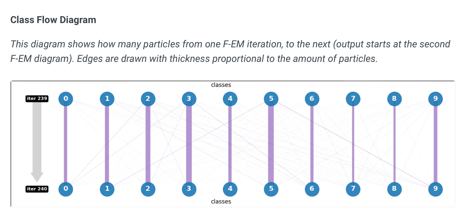
I like the idea of the new class flow diagrams in 3D classification, however, because all flow lines are the same color, it is very difficult to perceive connectivity (and to distinguish self-self connections from actual class switching).
If it was possible to select classes one by one, it might be easier to see, although that would get complicated - maybe it is possible to have an interactive figure, like that used for higher dimensional clustering in 3D-VA?
Alternatively, perhaps a difference-distance style plot might work better (e.g. like Difference Distance Matrix Plot Description) , colored by the percentage of particles that have switched?
Cheers
Oli
1 Like
@olibclarke thanks for the suggestion! We’ll definitely take a look at making this plot clearer. One clarification:
and to distinguish self-self connections from actual class switching
The self-self connections are the thick vertical edges. Note that the edge widths are set proportional to the amount of particles in that connection, normalized by the most populous edge, including self-self edges (e.g., in this case, with respect to the 5-to-5 self connection). Are these difficult to see for larger amounts of classes?
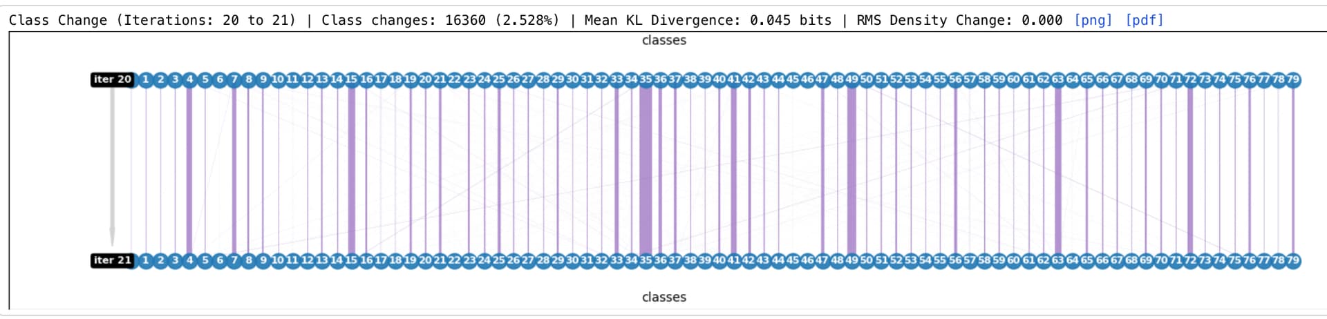
Yes - for large numbers of classes the thin lines get very thin, and cross over a lot, so it can be a bit difficult to see connectivity - this is not the best example, but from one I am running now:
Ok got it, thanks! Perhaps we can do something different (a la distance matrix plot you suggested) for the case when N_classes > 50 or so.
1 Like
Great! The other kind of plot that might be useful for monitoring convergence is a cumulative class percentage plot, kind of like this one for covid variants:
This allows you to monitor easily not just how many particles are changing classes, but how each class is changing in size as a fraction of the entire dataset (obviously this might get a bit tricky with 80 classes, but one could prob show just the top 10 or 20 and have the rest listed as “other”).
The reason why this (or something like it) is useful is that it captures directionality of change - if a class is changing by a small percentage in each iteration, but is consistently gaining particles, that is a very different situation from a class that is gaining a few particles one iteration, then losing them in the next.
2 Likes
@olibclarke FYI: 3D classification in v4.1 now includes a ‘class flow matrix’, updated colours/aesthetics for the default class flow diagram, and a ‘delta’ column in the class table. Thanks for all of your suggestions – hopefully these will come in handy!
7 Likes
Great, thanks!! Look forward to trying it out 
1 Like