Hi,
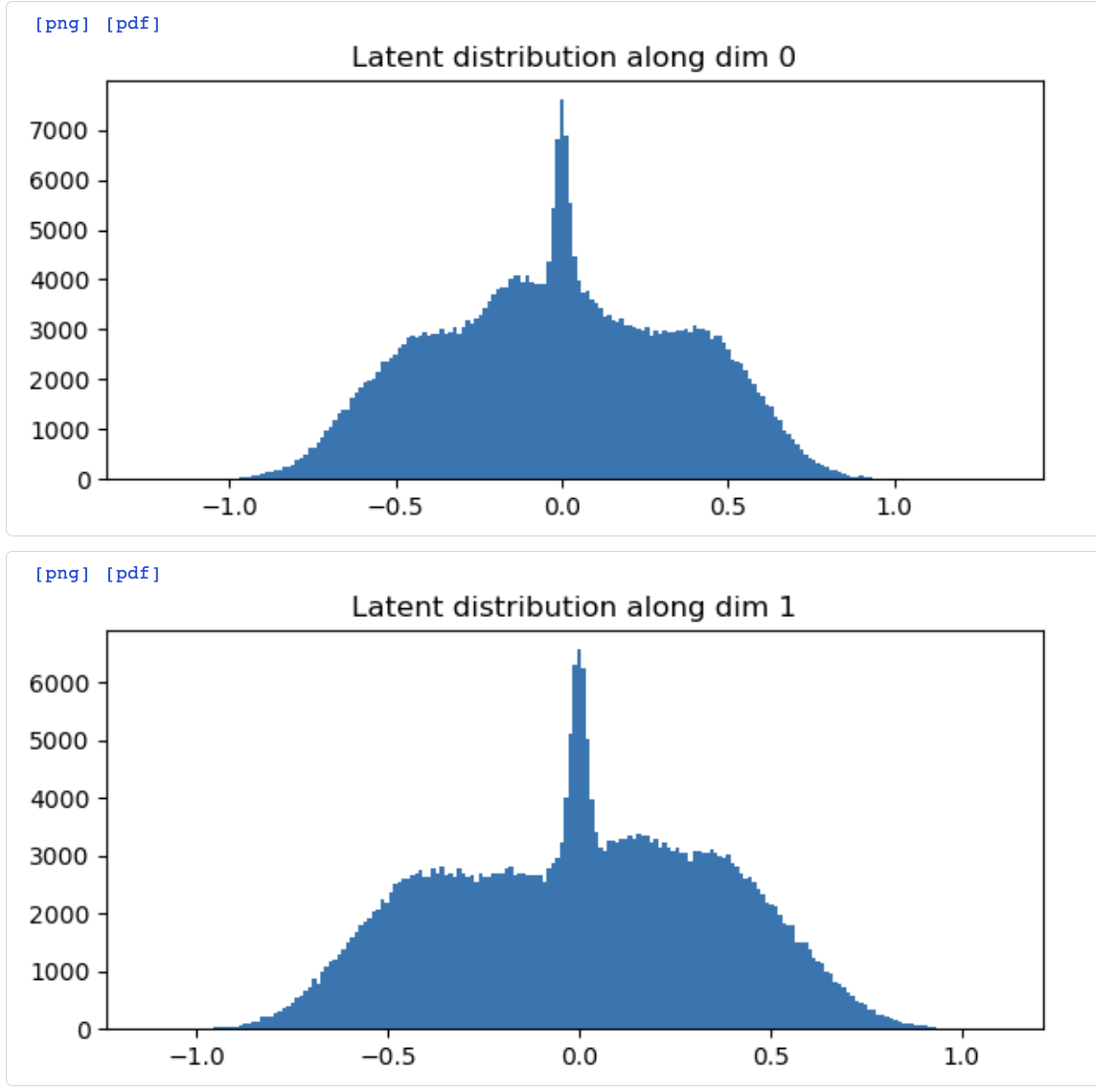
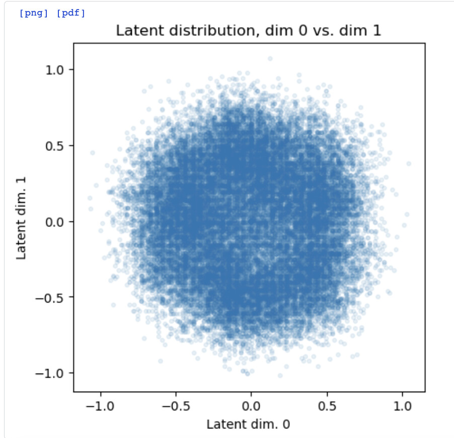
In 3D-Flex Train, I wonder if it would be better to show the latent distribution plots as heat maps (binned and colored by coordinate density).
Quite often I see results like the attached, where it is apparent from the 1D histograms that there is a quite significant spike at 0,0, but this is not at all clear from the 2D latent distribution plot(s).
Cheers
Oli