Hi,
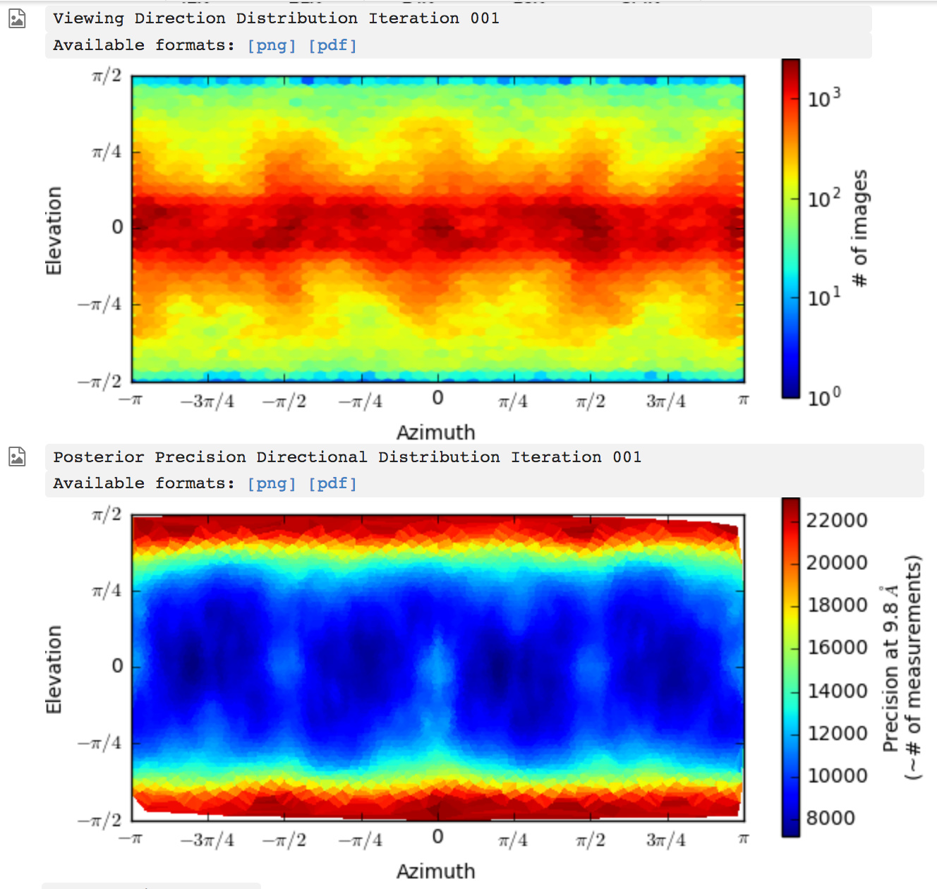
I was wondering if @apunjani or someone else on the cryosparc team could give a brief explanation of what the posterior precision plot of the orientations is intended to convey, beyond the information that is directly conveyed by the plot of orientations above it?
The way that the scale is labeled it seems to indicate that the color gives the number of measurements required to achieve a given directional resolution - is that right?
Secondly, I have a suggestion regarding the scaling of these plots.
Currently, they are automatically scaled from the minimum to the maximum number of images at any given point, with the colors used not sensitive to whether the difference in population between orientations is large or small. This means that pathological cases can be difficult to distinguish at a glance from normal cases with a slight preferred orientation. If instead the top plot was plotted by the percentage of the dataset, and colored accordingly (from 0% to 100%), I feel like this would give a more easily comparable scale for orientation preference.
Or alternatively coloring relative to the expected population of each orientation based on an isotropic distribution would be another way to go - some indicator that shows in absolute terms at a glance how much more or less populated a given direction is than another.
Right now, if there is a 10% difference in population between the most and least populated directions, it looks visually the same as if there is a several-fold difference (unless one inspects the scale carefully), because of the way the scale is colored.
Cheers
Oli