Hi @magda and welcome to the forum!
Plotting local resolution maps can be challenging — I myself have to remember how to do it basically every time. Here’s the process I typically use when producing one of these figures. For this example, I’m using some data I’ve processed from EMPIAR-10025.
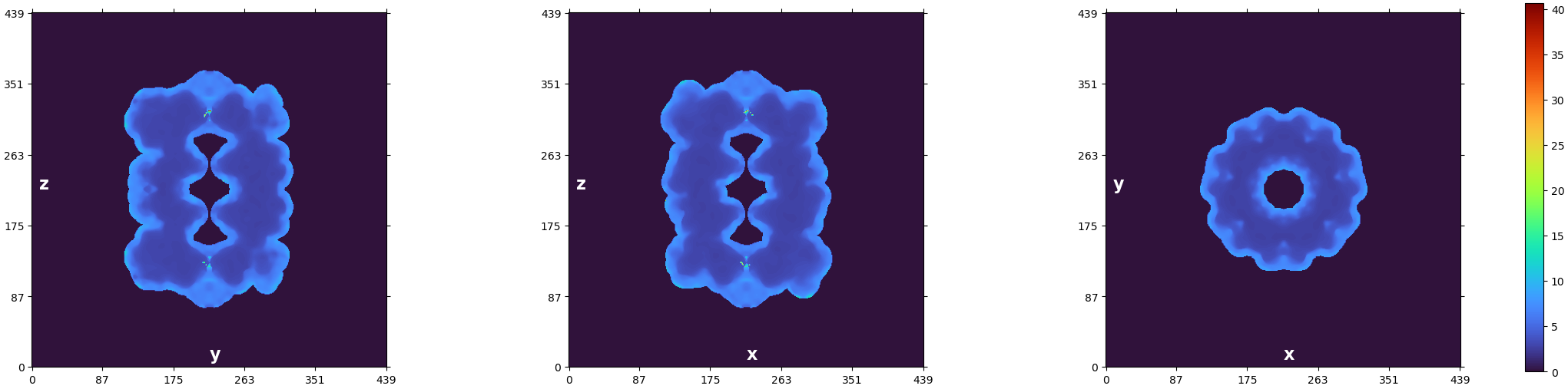
How many voxels are in each resolution shell?
The first thing I’d recommend is to check out the plot CryoSPARC produces at the end of the Local Resolution Estimation job:
We can see that the resolution technically goes from 1.4-ish Å to 40 Å – but visually we can see that the majority of the voxels are in the region from about 2 to 5. You can also read out the statistics from the log message:
Local resolution stats (min, 25th percentile, median, 75th percentile, max):
(1.396, 2.935, 3.525, 6.452, 40.644)
We know that half of our voxels fall between the 25th and 75th percentiles (2.935 and 6.452, respectively). A quarter are below that range, and a quarter are above. So if we plot the full range from 1.4 to 40 Å, we’re using the vast majority of the color scale (from 6.4 to 40 Å) to cover only a quarter of the voxels!
How does ChimeraX color the maps?
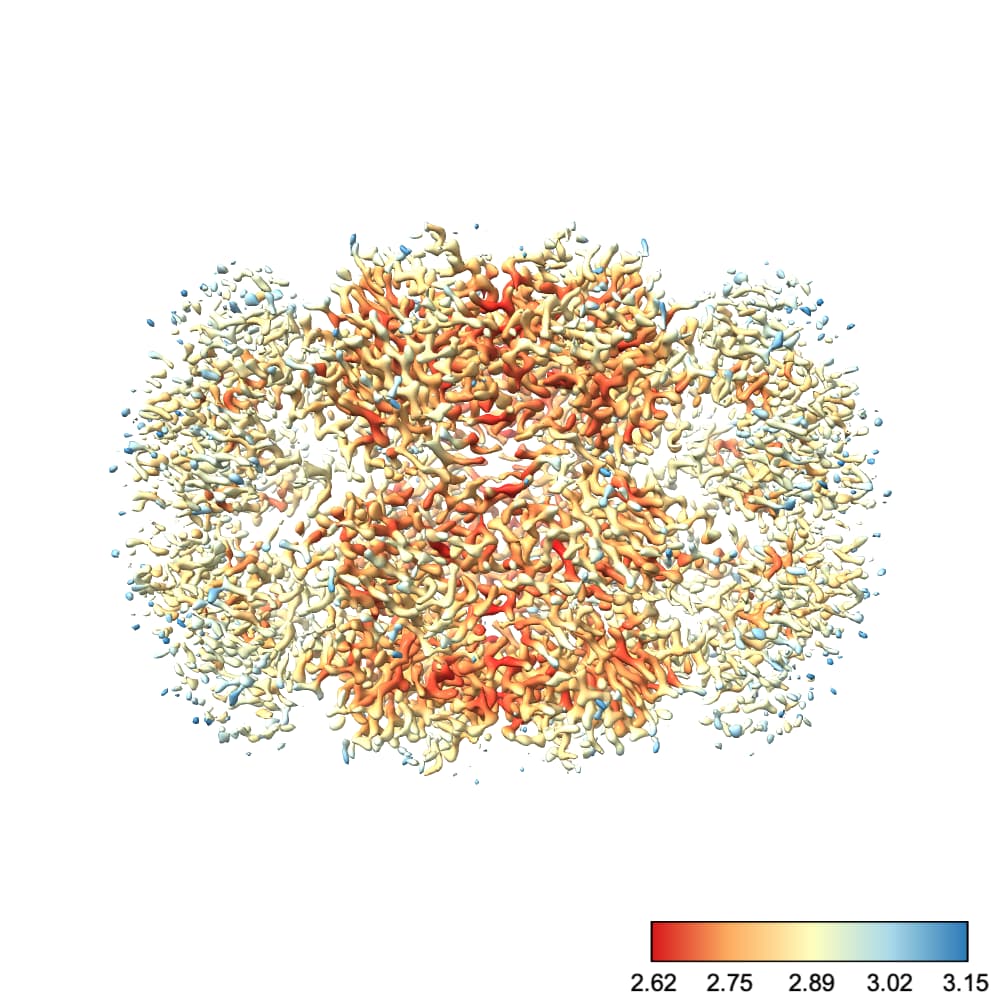
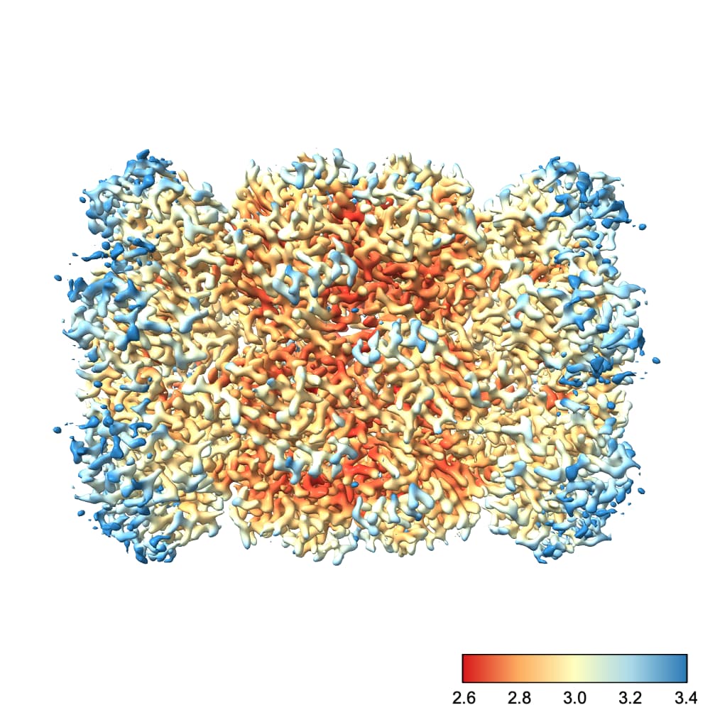
By default, ChimeraX uses the full color range to cover values plotted at the current contour. I find this rather unintuitive. For example, at this contour we see a nice degree of variation across the protein:
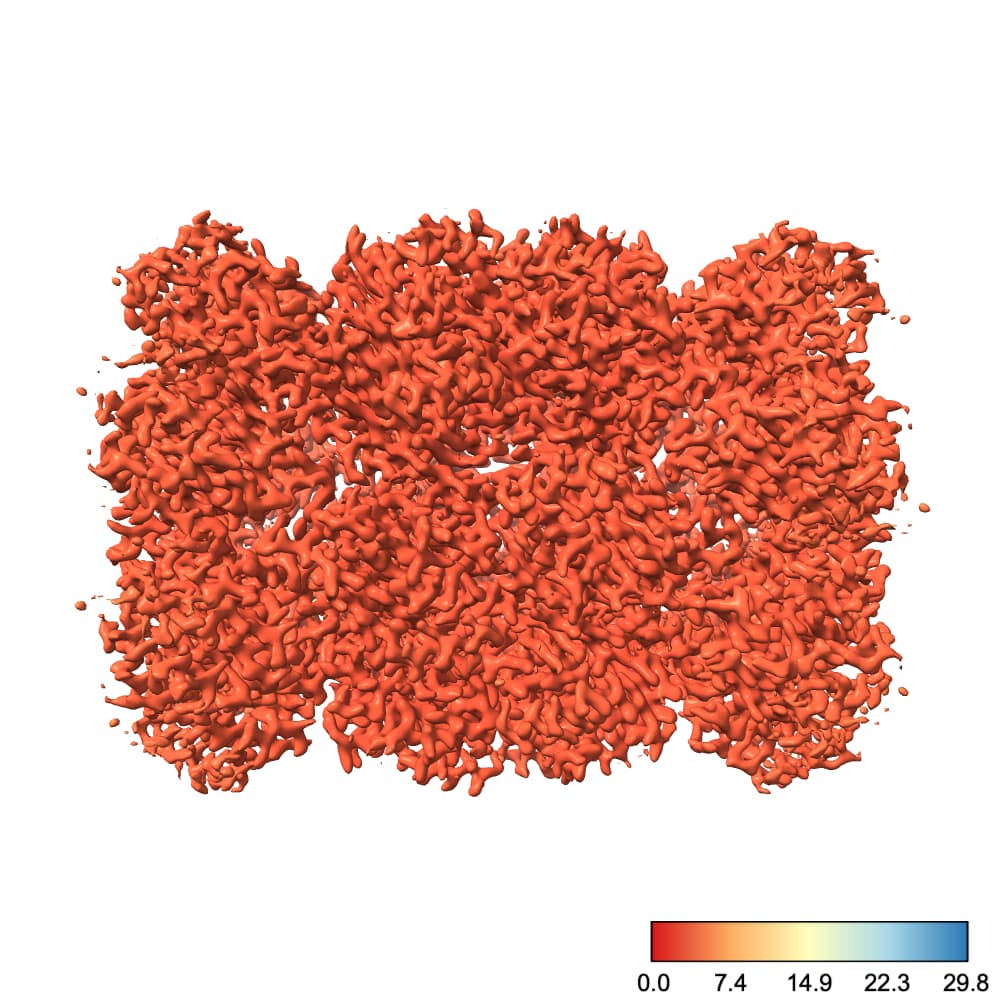
However, if I go to a slightly lower contour so that we can see more of the protein, suddenly the entire thing is colored with one color:
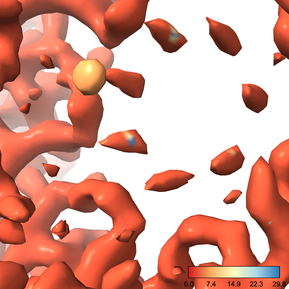
Why did this happen? Well, there’s one little blob on our map which has a low local resolution, so the color scale jumped up to make that value blue. This means everything else, which is likely all < 3.5 Å, is lumped into the red region
We can fix this by choosing the color scale manually. You’ll also note that I prefer a different color scale to the default red-white-blue, which I find has jarring transitions. Finally, I also create a color bar so I can see which color corresponds to which resolution. This makes it easier to diagnose problems with the map.
So, running the command
color sample #1 map #2 palette rdylbu key true range 2.6,3.4
produces this image:
To explain each part of that command:
color sample #1 map #2 tells chimeraX to color the surface of the current contour of #1 (the refined map) using the values contained in #2 (our local res map)palette rdylbu selects my preferred color palettekey true draws the color bar in the bottom right. It will also open a window you can use to make changes to the color bar.range 2.6,3.4 sets the resolution range covered by the color scale. Note that any values lower than your minimum will be the same color as your minimum and any values higher than your maximum will be the same color as your maximum. Note also that there is no space after the comma in this argument.
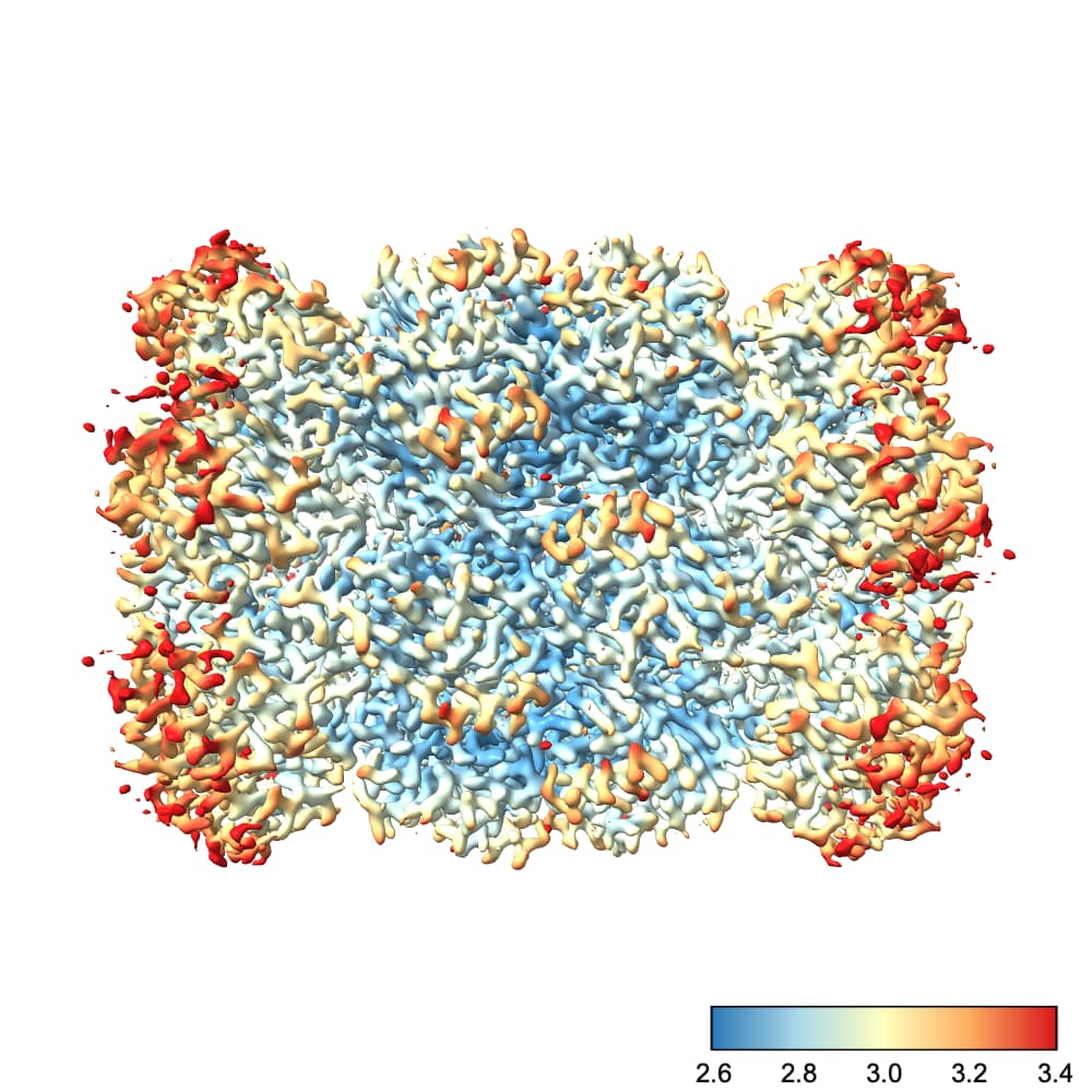
Another tip: you can reverse a color palette by prefixing it with ^. For instance, replacing rdylbu with ^rdylbu in the above command produces this image:
I hope that helps!