Hi everyone!
I’ve seen some users on this forum recommend running the ResLog job to determine factors limiting the resolution of their map, but I’m having trouble interpreting the results. The original paper states:
Specifically, the y-intercept of a regression line provides a measure of the relative accuracy of the particle alignment and classification, and the slope is an indicator of the overall data quality including the imaging conditions and processing steps.
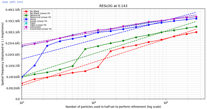
From this, I understand that they generated artificial datasets with perturbed alignments and that poorer sets of alignments led to lower y-intercepts. However, I’m not sure how to interpret a ResLog plot when working with just a single set of alignments. For instance, I generated the following ResLog plot for my data:
Is there a theoretical limit for how high the Y-intercept can be, and should I aim for that by improving alignment and classification quality? Similarly, is there an ideal slope for high-quality data?
I also came across this post, which mentions that the linearity of the trend is also important. Since the “corrected” curve in my plot is fairly linear, does this mean that the only way to improve my resolution is simply by collecting more data? If so, the return on investment seems pretty low. Is there any way to tell from the plot whether improving the alignments is even possible, or am I truly just limited by the number of particles I have?
Cheers,
cbeck
