Hi,
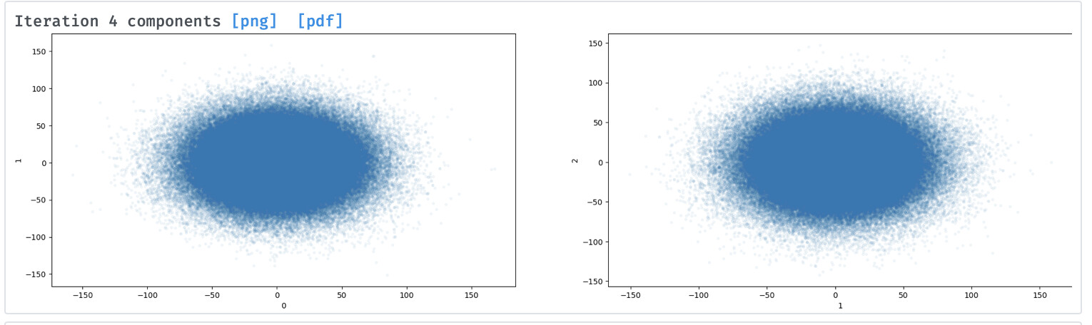
The display of 3D-VA results as a dot plot for clustering purposes is informative when the clusters are clearly defined, but can be less so when clusters overlap.
Would it be possible to color these plots by dot density, to create a pseudo “free energy landscape” type plot? This may make it easier to see local variations that are otherwise obscured by the very large number of points.
Cheers
Oli