3D flexible refinement latent distribution plot

Hi,

I am working on a 100 kD protein with a flexible domain which can be seen from 2D averages
I then ran the 3D flexible refinement job and got a plot below.
image
for both dimensions, I could not see obvious motion. The plot looks like a “V” shape, which make me think I should have two distinct conformations. I’m just wondering whether sampling following the V shape can demonstrate better motion? How to better visualize the result? Thanks!

I’ve noticed that you tend to see “interesting” patterns in the early iterations that vanish later on. (Turns back into a Guassian).

I’m inclined to think the latter behavior is the accurate one and these “V” shaped plots are a sign of poor convergence. What does 3DVA look like?

1 Like

Hi Daniel,

Thanks for the reply. I guess i still don’t quite understand what this plot means, how can you tell where is the early iteration (and where is later) from this plot? Do you have any resource to better explain what X and Y exactly mean in the plot?

Also, for poor convergence, how to tell that from the plot? I tried 3DVA, with same particles, the map looks poor, and i could not see reasonable motion. Somehow the canonical volume generated from the 3D flex training gave much better resolution. However, when i took the flex model to do flex reconstruct, the map got worse. A short summary, with 3D flex training, i got improved map, but not with 3DVA or 3D flex reconstruct, why could this happen?

Hi @qqma! It’s awesome that you can see flexible motions from your 2D classes — hopefully we can help you resolve that in 3D! I will say that 100 kDa is a little small for 3D Flex, but I (and others on the forum) will do my best to help you see where you can get!

In this explanation I’m going to simplify a lot so that we can try to understand what’s going on with your data. If you’re curious and especially if you are planning further processing based on my explanation I strongly encourage you to read our paper on the topic and check out our guide pages on 3D Flex before moving forward!

What are the plots?

Let’s start with your question of what these plots represent. I will provide what I hope is an intuitive explanation, but I really want to emphasize that I’m simplifying a lot here.

In 3D Flex jobs, we’re modeling how your target deforms/flexes by modeling flow from one position to another. It’s easiest to think about this in 2 dimensions to start with: let’s say you have a bunch of images of a 2D particle which look like this rectangle:

But the top part of the rectangle is flexible: your images look like some of these:

You know that all of these rectangles ultimately come from the same particle (that’s why your particle stack has to be clean!), so you know that the information from the top of all the rectangles can be used to reconstruct a good map of the base, unbent rectangle. The question is how to do that. In 3D flex, we model deformation of each region of each particle (the pixels making up the blue and pink rectangles) relative to the consensus (black rectangle) by flowing density from one area to another.

In this case, it’s clear that the deformation involves a high degree of movement at the rectangle tops, and a low degree of motion at the bottoms:

This is our “flow field”. I’ve included the outline of our consensus rectangle for reference, but the important parts are the arrows. These represent the force we apply to the rectangle to get the images to agree with the consensus.

But I’m sure you’re already seeing a problem — the blue and pink rectangles need different forces applied to them to recreate our “base” image! Training our 3D Flex model does two things:

  1. It figures out what flow fields are necessary to represent the deformations present in the whole particle stack
  2. It maps each of those different flow fields to a coordinate system.

I hope you can understand now what I mean when I say that 3D Flex coordinates are very non-linear! You might want to check out the video on 3D Flexible Refinement in our guide to see how complicated the flows captured by the latent coordinates really are!

How can we tell the model hasn’t converged?

Now that we know what these numbers represent, we can think about how we expect them to be distributed. If a particle is flexing back and forth (like our rectangles are), we would probably expect that there are relatively few particles that are flexed all the way to the extremes. Therefore, we might expect the weights in our flow fields to be more-or-less normally distributed, like this:

J20_ (1)

So, you can’t tell the iteration directly from these plots. I believe @DanielAsarnow is pointing out that often earlier iterations will not behave as we expect (normally distributed weights for each flow field), but that as the model gets better the weights settle into the expected distribution. That’s also (I think!) what he means by “poor convergence” — the model hasn’t decided exactly where each particle image belongs yet, based on the unexpected distribution of the weights we see in your plot.

There is, however, no theoretical reason to expect that particle weights must be normally distributed. It is one of those annoying things that just happens to depend on your data and on your parameters.

One other thing I noticed about your plot is that the particles are all quite close to 0 in both dimensions of the latent space. There is a parameter you can tune during training, the Latent centering strength, which can spread the points out. This parameter should be tuned until particles fall between -1.5 and 1.5 without clustering at the edges.

Why do your maps look worse?

It’s too bad the flex refinement didn’t improve your map! One really important factor that might explain why your 3D Flex Training map looks the best is that it uses all of the particles in your dataset. This means that there are no half sets, and so there is no prevention of over-fitting. This means that maps may look better (especially in the low- or mid-resolution regions), but that they are far more sensitive to over-fitting or spurious noise. The other jobs you mention do obey the gold standard half set assumptions, and so they can be filtered to a resolution at which we can be confident there is little overfitting noise.

One last thing to remember is that 3D Flex will only capture continuous heterogeneity if it is really there. Since you don’t see any significant movement in 3DVA, you may want to consider the possibility that the particles are relatively rigid.

I hope this is helpful!

6 Likes

Thanks @rposert for this very clear explanation! Relatedly, can you explain what is going on in the plot titled “example flow at positive value of latent dim 0” in 3D-Flex Train?

It only refers to dimension 0, but having initialized from 3D-VA, two of the slices look very similar to separate modes from my 3D-VA job that I used for initialization, so I just want to make sure I understand properly what it is showing.

Cheers
Oli

Hi @olibclarke! I’ll answer your question about the plot, and also take advantage of your follow-up to provide a little more detail on the latent spaces. I simplified a lot in my first explanation, so in case anyone else reading wants a little more detail (before I have time to update the guide :innocent: ) I’ll include it here.

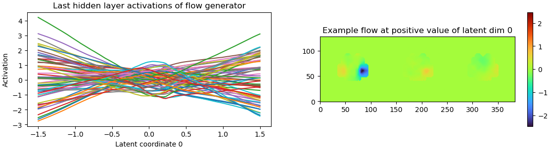
What’s the example flow plot?

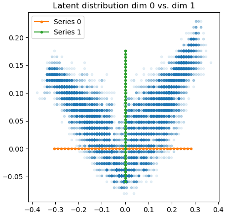
The plot you’re describing is more of a sanity check than something that really tells you important information about your model. The left part just measures the activations — you want this to look “not too flat, not too squiggly”.

The plot on the right looks like a 3DVA plot, but it’s a bit different.

Recall that in 3DVA we’re scaling and adding a “difference volume” to the consensus volume. So we can plot an unscaled difference volume to see what that mode of 3DVA is doing.

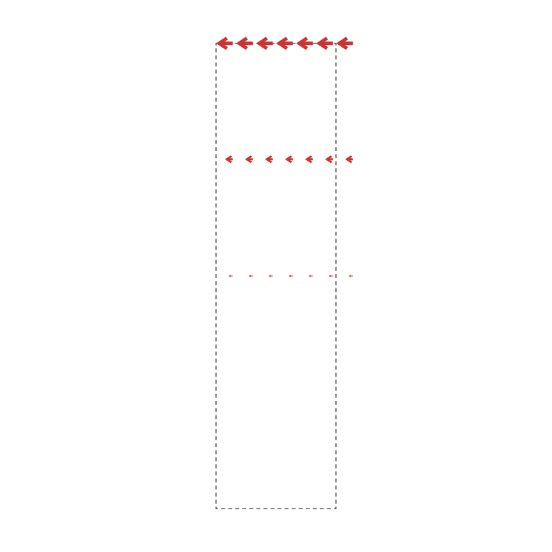
Here, though, we’re moving density around rather than adding and subtracting it. So we need to think about both the three dimensions of the model, plus the three dimensions of the flow field. That’s a bit much for a 2D plot, so same slice of the volume in all three parts of the right-hand plot. Each slice has a different dimension of the flow field plotted on it, with the colors telling us how far the flow field wants to move density from that region. The flow field plotted is taken from the particle with the highest (i.e., furthest) coordinate in latent coordinate 0.

For instance, in the plot above, we see that the particle furthest along component 0 wants to move the density at the right-hand side of this slice in the approximate direction (-2, 0.5, 0.5). It wants to move the left-hand side of the slice in the approximate direction (0.5, 0, 0).

Like the activations, you’re basically looking for “something” here. No color at all means the flow field isn’t moving density anywhere, really noisy colors means density is getting thrown all over the place, which is probably not what’s actually happening to the particles.

I hope that helps explain these plots! Now on to

More on latent spaces

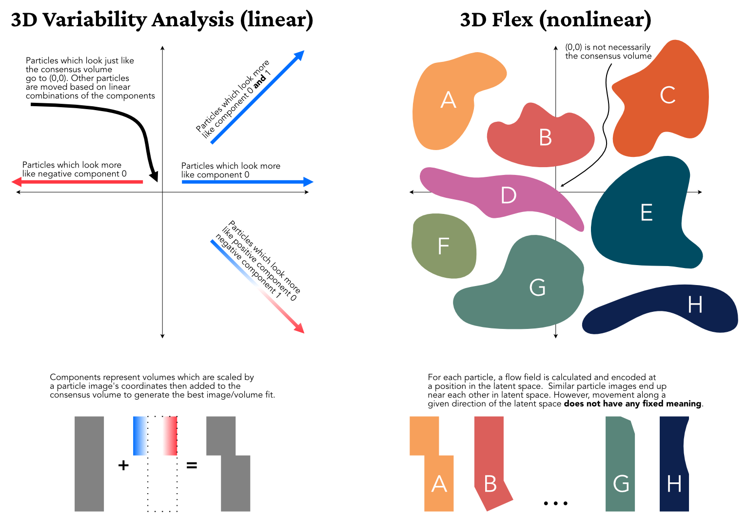
3DVA is linear, so each particle gets placed according to the linear combination of each component which best explains the observed image. When you plug those particles into 3D Flex Train jobs they are assigned that same coordinate position in the latent space, but during training the latent space may expand to incorporate other types of motion. This could in turn move the types of motion modeled by the linear 3DVA functions closer to each other in the highly non-linear latent space.

For a simple example, consider a water molecule’s vibrations: asymmetric stretch, symmetric stretch, and bending. Providing 3DVA with two modes resolves symmetric stretch to component zero and asymmetric stretch to component one. However, 3D Flex also detects bending. Since the latent space is not linear, it can “move” particles from their linear 3DVA coordinates to coordinates which “make room” for the bending motion as well.

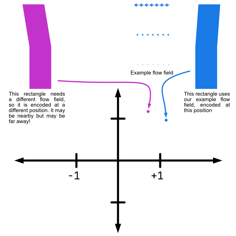
For another way to think about this: a coordinate (a, b) in 3DVA’s coordinate space means “this image is best modeled by multiplying a * V0 and b * V1 and adding the result to the consensus map”. The same coordinate in 3D Flex means “this image is best modeled by deforming the consensus map by the flow field encoded at (a, b)”.

This has a few pretty significant implications. Most importantly, a latent space dimension is very different from a 3DVA dimension. Since 3DVA dimensions are linear, each dimension captures a “type” of conformational change, and a particles coordinate tells you “how much” of each “type” of change that particle has applied to it. This means that you (ideally) need as many coordinates as you have distinct types of motion.

Contrast this with 3D Flex latent space coordinates. I think it is best to think of latent space coordinates as “neighborhoods”. In each region of latent space you have particles which look similar to each other (more precisely: which are best-modeled by similar flow fields). This means that moving along an axis in the latent space is locally defined — the difference between (0.5, 0.0) and (0.6, 0.0) might be (and, indeed, probably is) very different from the difference between (0.5, 1.0) and (0.6, 1.0). This is one of the reasons for noise injection during training — we want to ensure that (a, b) looks similar to (a + e, b + e) for small e, but the model could put dissimilar flows near each other. We thus “blur out” latent space coordinates to ensure the desired local smoothness.

Note also that since the latent space is not a linear span, there is no reason to expect that (0, 0) corresponds to the consensus map. In fact, it is not certain that any coordinate in the latent space will correspond to the consensus map.

This also means you can “fit” far more distinct states in a latent space with two dimensions than you can in a 3DVA coordinate space with only two dimensions. I like to think of dimensions in latent space as describing the greatest number of adjacent neighborhoods the 3D Flex model has access to.

Note that we’re still modeling the same object — it will still have the same degrees of freedom, since that is an intrinsic property of the object. However, 3D Flex’s nonlinearity means we may be able to embed more states of that object in a lower dimensional latent space than 3DVA’s coordinate space. We will not, however, then be able to model the transitions between those states, so the model (and therefore reconstruction) will be incomplete.

For me, at least, latent spaces are very difficult to think about and I constantly find myself falling into the trap of thinking about them as if they are linear. I thus want to add a final way of thinking about latent spaces to this very long post.

I have found visualizations of latent spaces of the MNIST handwritten digits dataset very helpful. I think these give a nice intuitive view of what’s happening in a latent space. For instance, the figure toward the bottom of this article samples the latent space at a fixed interval. We can see that, at high values of z[1], moving along z[0] rotates and morphs the handwritten 0. However, at low z[1], moving along z[0] turns a 7 into a slanted 1 without really rotating the main stroke very much. Similar non-linearity is visible in the z[1] component. (Note that 3D Flex uses an auto-decoder rather than that website’s VAE, but the principle is still similar).

1 Like

Thanks @rposert that is very helpful! One followup question:

Could it be beneficial to select subsets of particles based on their behavior in an initial round of 3D-flex, then re-refine thew subset prior to a second round of 3D-Flex?

I am imagining that particles which are outliers in the latent space could be outliers more generally, and so the preceding reconstruction may improve if they are removed (maybe possible using cryosparc-tools?) Or am I thinking about this the wrong way?

Cheers
Oli

It could certainly be helpful! I think it all depends on how much signal you’re losing at each step, and how well your 3D Flex model is able to partition particles into those that are truly similar in some important way. I know that’s a bit of a cop-out, but it’s hard to say a priori.

One thing that will dramatically improve 3D Flex results is removing/reducing junk particles and compositional heterogeneity (i.e., partial occupancy). But if that’s in your stack, 3D Flex won’t do a good job separating it out anyway, so it would be the wrong tool for the first job.

But, for an example where I’d expect (note, I haven’t actually performed this experiment) it to help would be if you have two big domains which flex relative to each other. Pulling out particles with similar alignments of these domains, re-aligning them, and using those consensus alignments to train a new model might “free up” some latent space that was wasted on poor alignment of otherwise similar particles.

Of course, the question is, does this save you time over just increasing the dimensionality of your initial 3D Flex train…?

1 Like

Very helpful thanks @rposert! How would one test this in practice? To select particles in a particular region of the latent space?

I think cryosparc-tools would probably be the way! Here’s an example gist (this would probably be a bad way to actually select outliers!).

Once you had filtered the particles however you liked, you could use the External Job to load the filtered dataset into a project for further use.

2 Likes